Agatha Christie x Hunt A Killer
How do you take the work of the world’s third best selling author — following only William Shakespeare and, I guess, God (The Bible) — and put it in a box?
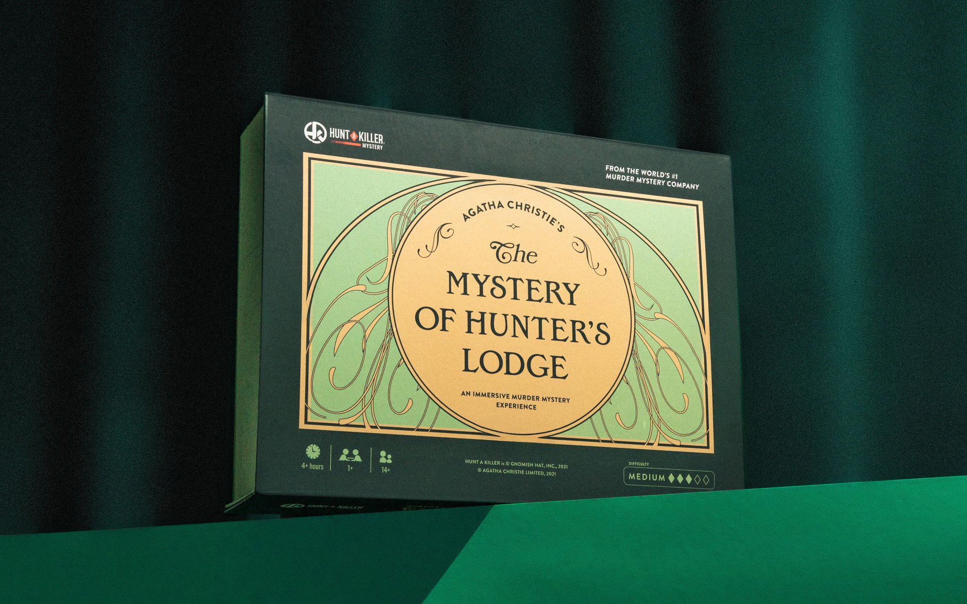
At Hunt A Killer, I led the visual design for Agatha Christie’s The Mystery of Hunter’s Lodge, an immersive tabletop game that transforms one of Christie’s classic short stories into a hands-on whodunit.
Role
Art Direction
Brand Identity
Packaging Design
Case Study Photography
Art Direction
Brand Identity
Packaging Design
Case Study Photography
Graphic Design
Ryan O'Neil
Ryan O'Neil
Illustration
Alaska Kellum
Alaska Kellum
Game Design
K.C. Chaney
K.C. Chaney
Art Direction
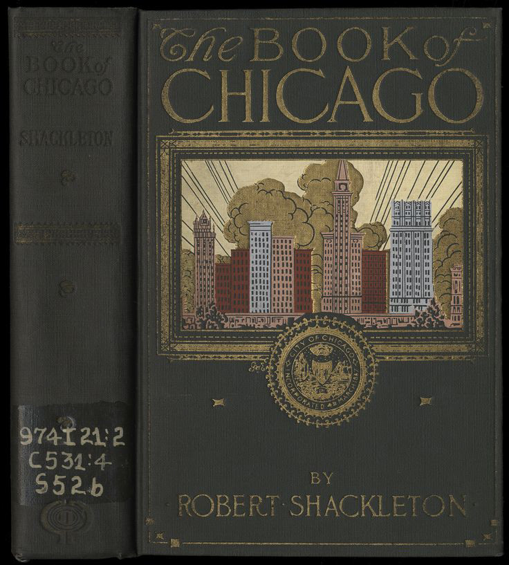
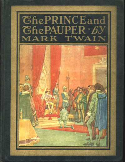
Research began with early 20th-century book covers and period fiction. Literary references, decorative flourishes, and a restrained palette created a world that felt historical and atmospheric without becoming overly literal.
Brand Identity
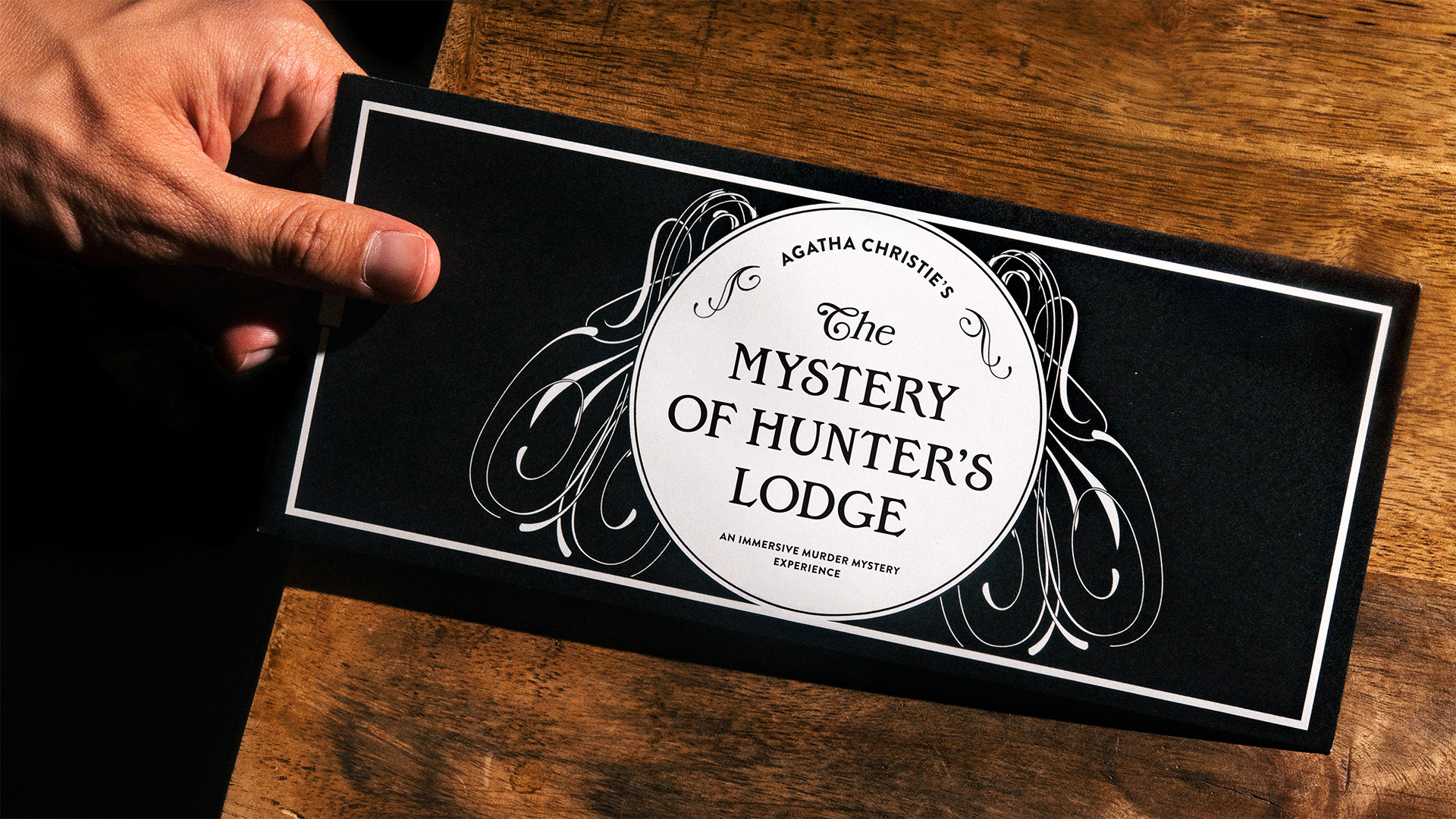
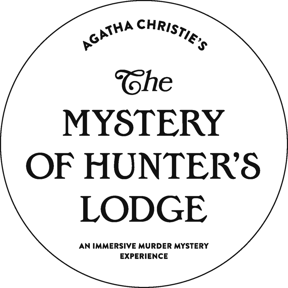
A recurring convention in period book design became the foundation of the identity: an ornate, script-like “The” paired with a formal serif title. Bookmania and Edwardian Medium recreated the formula, while Brandon Grotesque added contrast.
Packaging Design
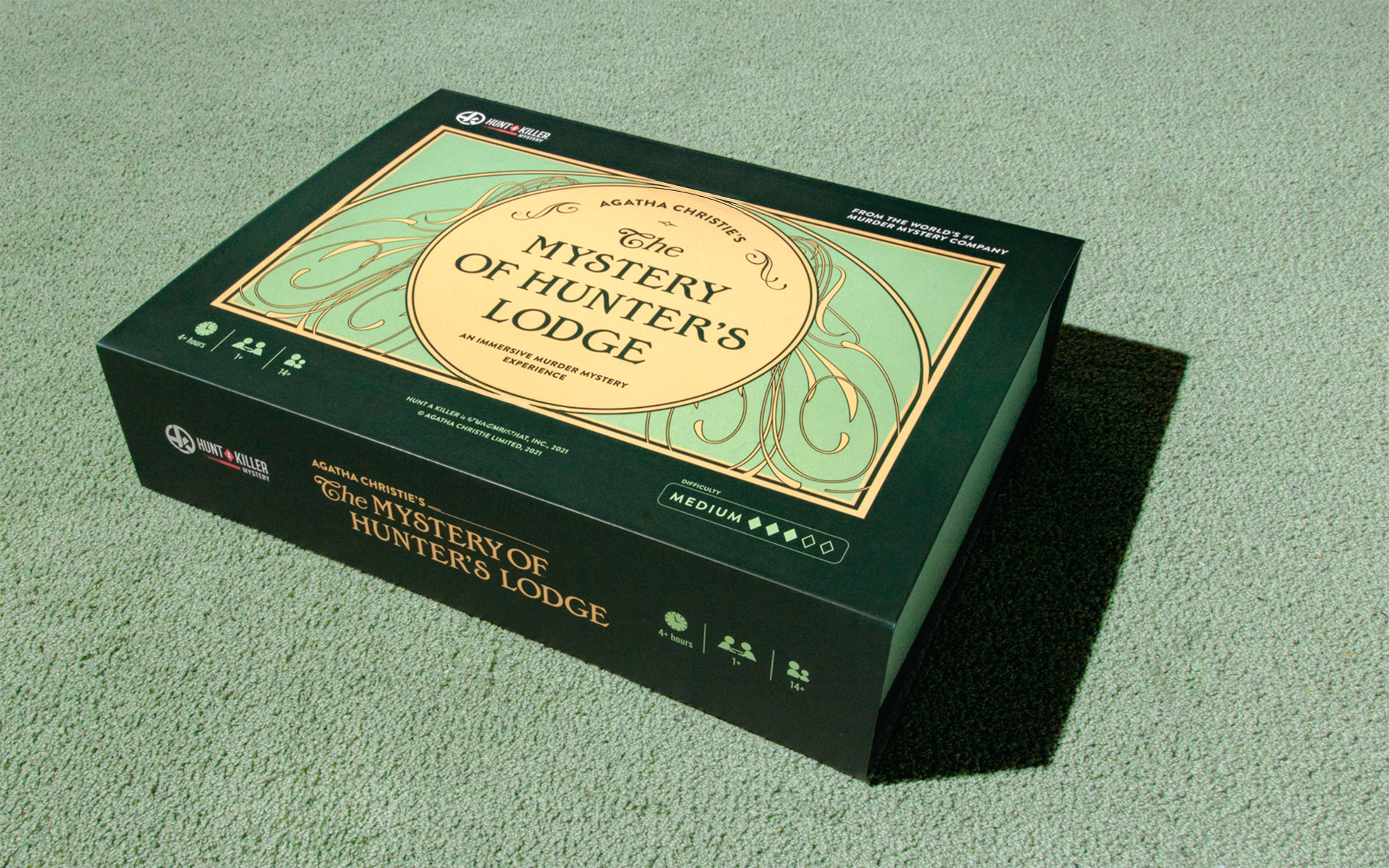
The packaging extended the identity through Art Nouveau-inspired linework and a palette connecting the bucolic English setting with a modern sensibility.
Game Design
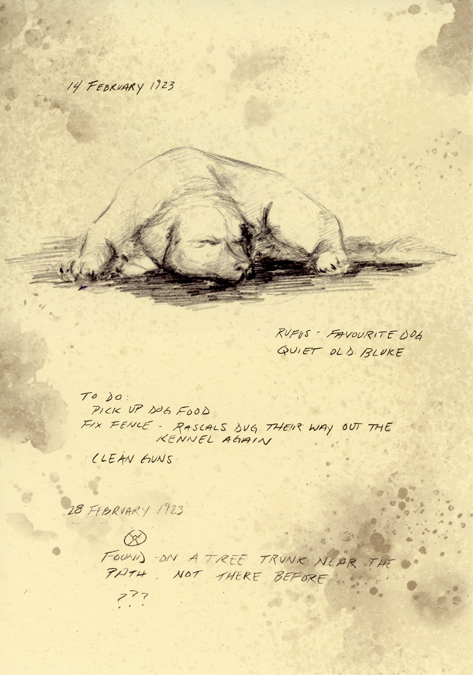
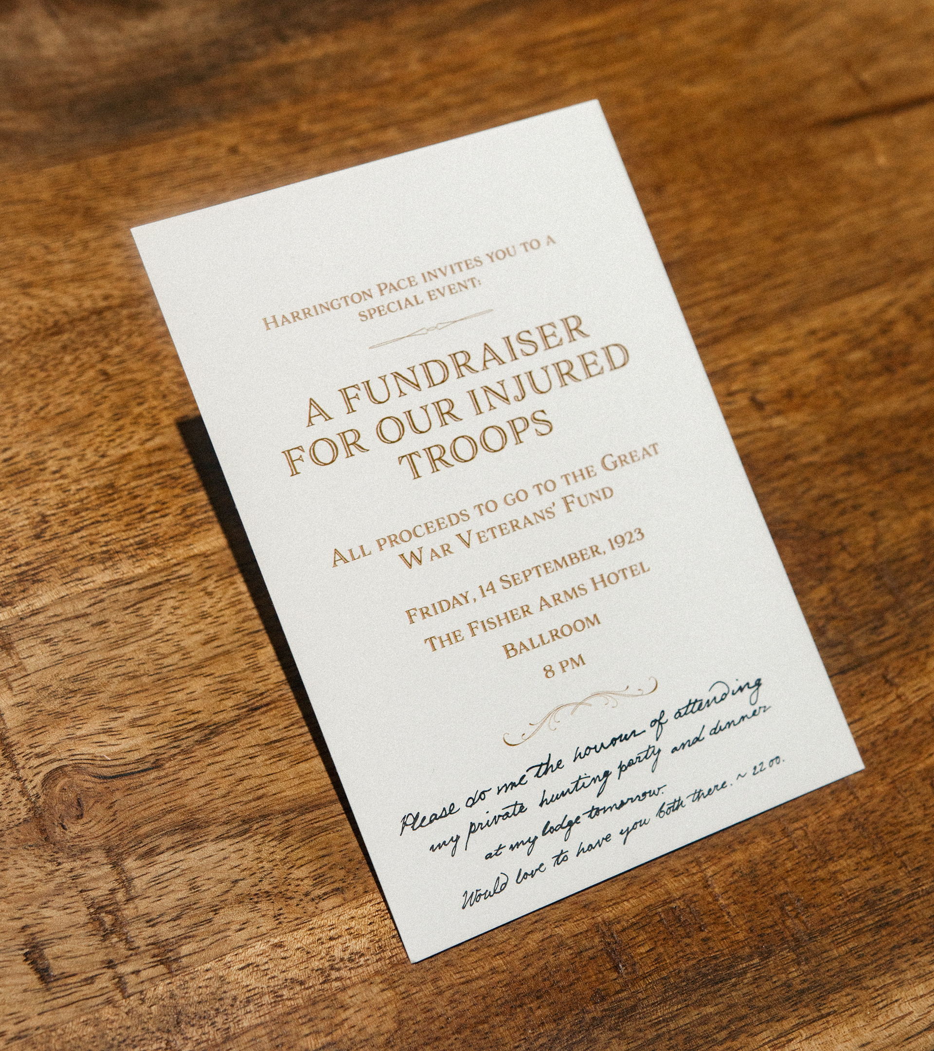
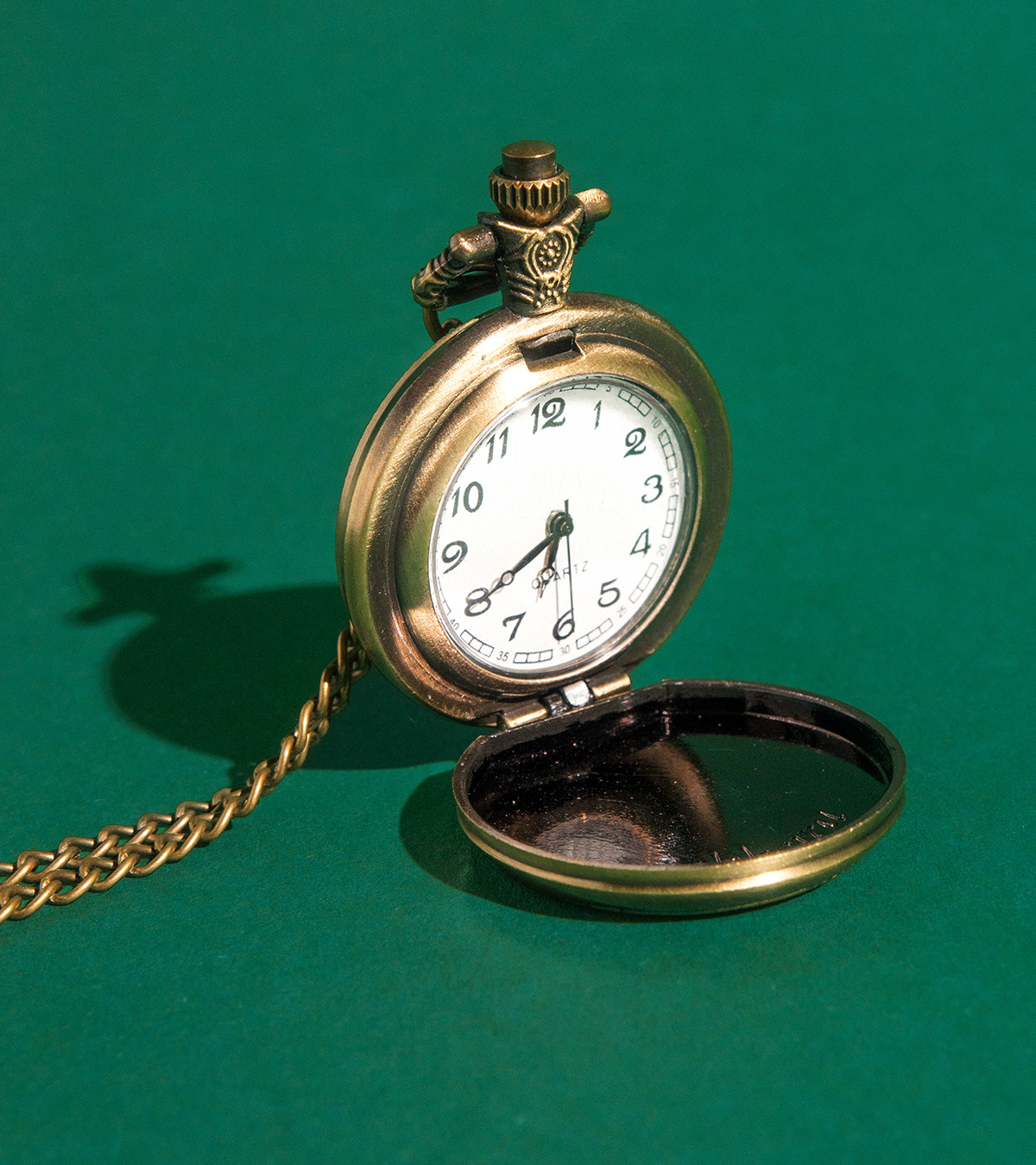
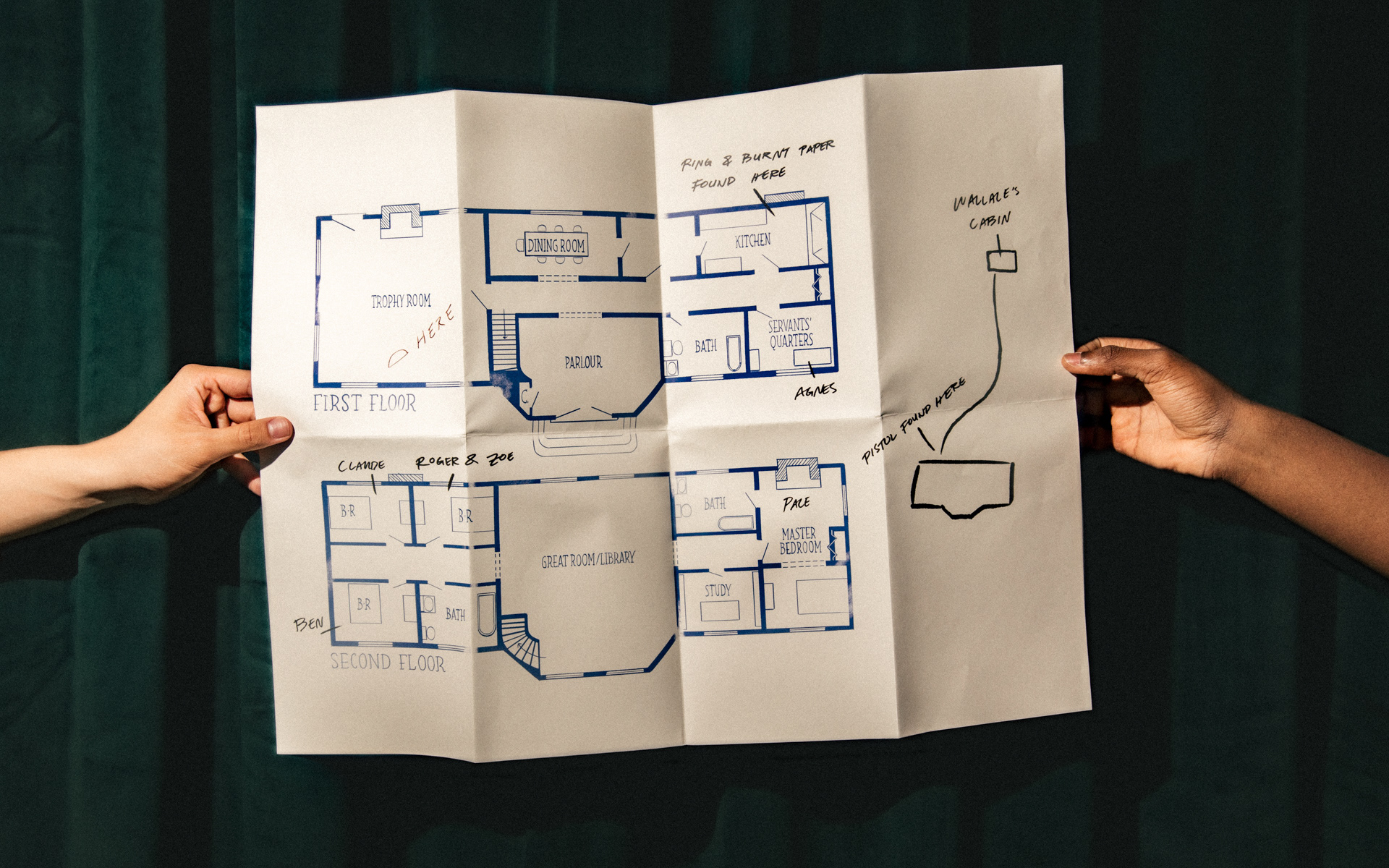
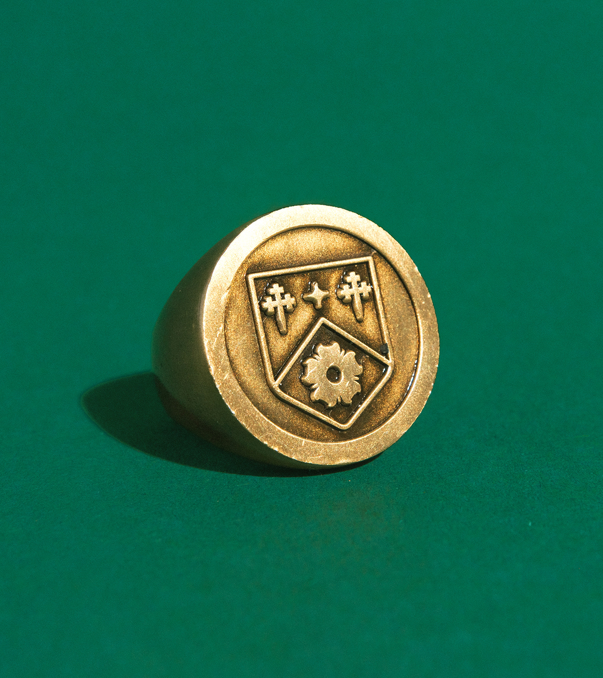
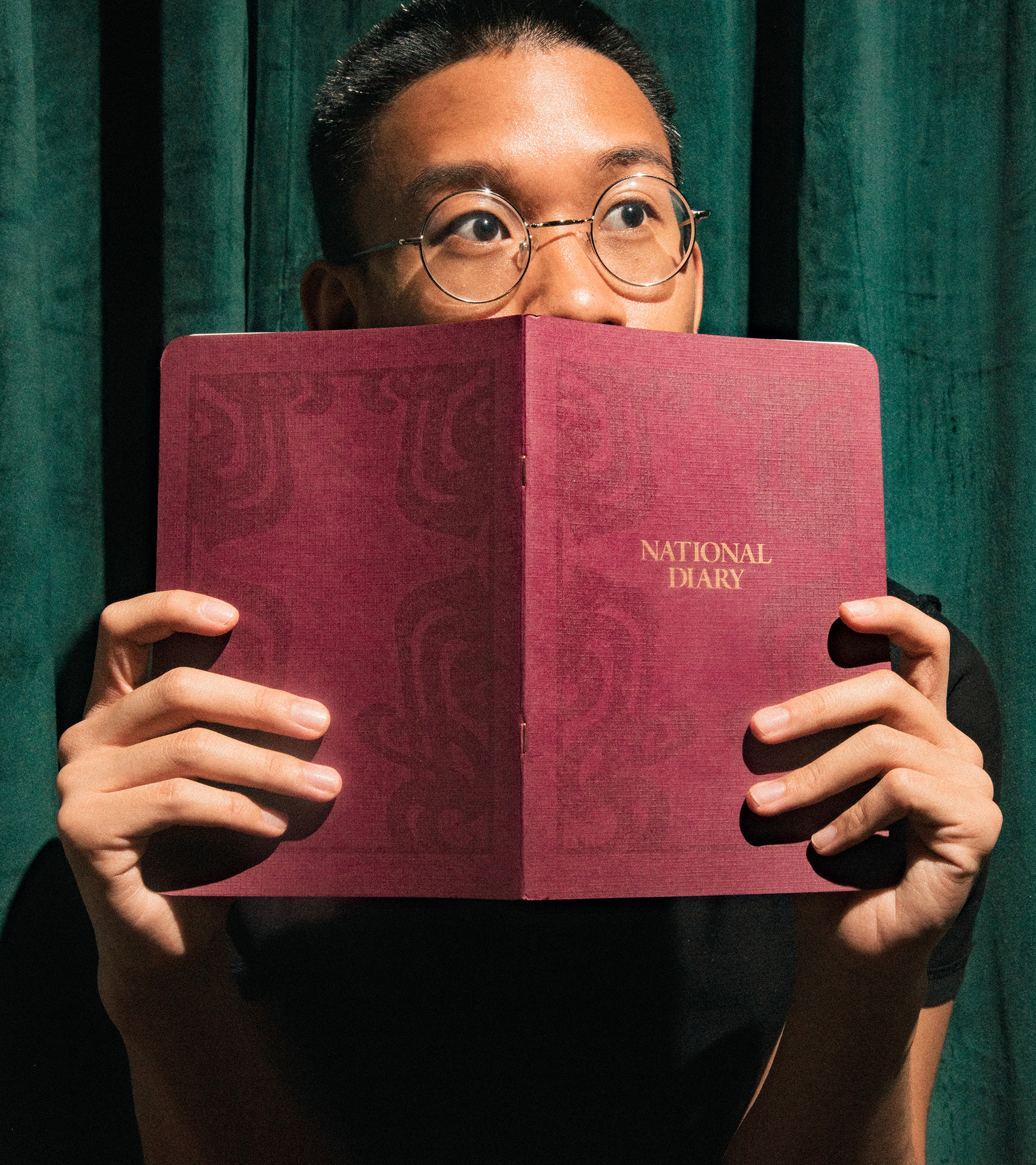
The story unfolds through letters, photographs, clippings, maps, diary entries, and found objects.
Each clue was designed to feel historically believable, visually distinct, and connected to the larger system as players assembled the mystery piece by piece.

Print Production
The identity extended across dozens of physical components, unified through typography, materials, image treatments, and tone.
The result was a cohesive archive of evidence supporting both the story and the mechanics of play.